A chart sometimes speaks in quiet signals long before a major move shows itself. Avalanche sits in one of those calm pockets right now, a place where price action slows just enough for patterns to become clearer.
Crypto Patel on X captured this moment in a chart that blends long-term structure with a support cluster. The picture feels like a market story approaching a turning point, with every candle pushing a little closer to a zone that has held firm for
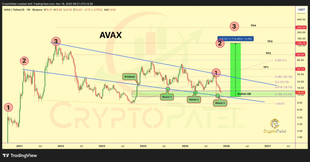
A look at Crypto Patel’s chart shows price tapping a level he described as a final accumulation zone. A 4-year support level, the 0.786 Fibonacci area, and the wedge structure floor all converge in this region. These three elements create a zone that rarely forms by coincidence. Price has returned to this area several times over the past year on the chart, almost like a repeating test, and now sits on it once more.
Crypto Patel noted that Avalanche is already down roughly 90 percent from its 2021 peak. His long-term view marks $15 to $11 as a potential buy region for anyone studying accumulation patterns. Market watchers following Avalanche price movements often study these deep retracement levels to understand where long term interest might rebuild.
Avalanche Price Structure Shows Clear Retests Suggesting Strength is Forming
The chart from Crypto Patel spotlights three retests around this zone. Retest 1 confirmed the wedge boundary, retest 2 reinforced the same zone, and retest 3 pushed price right back into the area where liquidity formed earlier in the cycle. This pattern creates a visual story. Sellers pushed price lower, buyers defended the level, sellers tried again, buyers returned. The cycle repeated until the price reached the exact floor once more.
Avalanche price behavior around this support gives a sense of a base being shaped gradually. Many traders pay attention to zones that keep holding after multiple tests, since they hint at steady interest even while the broader market feels uncertain.
A narrowing wedge pattern often acts like a spring that tightens over time. The Avax token sits near the lower boundary of this structure, and chart compression usually leads to expansion once the structure breaks. The chart shared by Crypto Patel shows projected targets above the wedge. Targets are placed near $43, $85, $145, and $302. These are not guarantees. They are simply technical projections based on past structure and levels that previously acted as major areas in price history.
A breakout from a multi year wedge does not happen quietly. It usually follows periods of sideways movement, emotional selloffs, or slow declines. Avalanche appears to be inside that exact phase. Price is low. Sentiment feels drained. The structure remains intact.
Avalanche Token Sits Far Below Its High While Traders Study the Accumulation Setup
Avalanche sits far below its previous high. A token that loses this much ground often reaches a point where the chart becomes more interesting than the sentiment around it. Crypto Patel emphasized this zone on his X page, noting that it aligns with a long run viewpoint rather than short term trading noise.
Avalanche token analysis tends to gain attention whenever the chart compresses into a corner of multi year structure. This is where patience matters most. Price near $14.42 reflects a deep discount compared to the earlier peak, and this alone becomes a reason many analysts choose to re examine the chart.
Read Also: Here’s Why MYX Finance (MYX) Price Is Pumping Today
Avax Breakout Projection Gains Attention Through the Chart Shared by Crypto Patel
Crypto Patel’s chart paints a story of possible expansion after a long cycle of compression. A green projection box marks the potential move from the wedge floor toward the projected levels. Each TP zone relates to earlier structural points in Avalanche history.
This method of mapping targets feels familiar to chart watchers who study Fibonacci levels and multi year trend lines.
Avalanche price movement inside this wedge behaves like a slow drift that keeps tagging the same structure. Patterns like this often split opinion. Some traders see risk. Others see opportunity. The chart leaves enough room for both interpretations.
Subscribe to our YouTube channel for daily crypto updates, market insights, and expert analysis.